
Sparkline, via THT:
 In this case, the Red marks indicate wins (or losses) of four runs or less. So they haven't been blowouts. But still. Yikes.
+/- 0.500 graph, via THT:
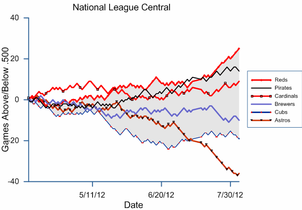 Not horrible 'til the All-Star break, then KerBloom!
And these don't illustrate the terribleness of the Volquez injury news...
::sigh::
No comments:
Post a Comment