
We always hear the players, managers, and owners of ballclubs say how they "have the best fans in the country." But can we quantify which cities really are the best baseball towns, and which are the worst? An obvious (and accessible) measure of fan interest is attendance. So to take a first stab at this issue, I decided to look at attendance relative to city population size. To do this, I employed simple linear regression. Attendance figures came from ESPN.com, and city population numbers are the '03 numbers from citypopulation.de.
An initial scatter plot comparing attendance to city population looks like this:
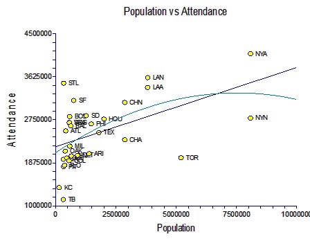
As you can see, there is a non-linear relationship here. I plotted both the first and second order polynomial lines to show this, and you can really see the shape of this curve most clearly if you ignore Toronto (TOR) and the New York Mets (NYN). To correct for this, I applied a log10 transformation to the population data, which straightened this line very nicely, which allows us to do further analysis:

[Note that now there is a much nicer spread in the data, that the first and second polynomials plot almost identical paths, and that there is no visible curve to the datapoints themselves, even if you ignore certain teams.]
This graph tells us a few things. First, we can predict attendance with some accuracy by simply knowing city population size. The R^2 on the linear regression of these two variables is 0.34, meaning we can explain roughly a third of variation in attendance based on city population size alone. Not bad given how many other factors must go into attendance rates; more on this later. Second, while most cities are fairly close to the line, some are clearly pretty far off the line. We'd expect that the best baseball towns would have a higher attendance than their city populations would predict, while the worst towns would have much poorer attendance and predicted. This can be quantified by looking at the residuals, which are just the differences between each team's actual attendance and the attendance predicted by the regression line:
| 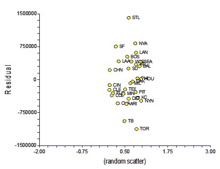 |
A few things jump out at me from this analysis. First, St. Louis fans attend far more games than you'd predict based on St. Louis's city population size. This is clear justification for people who claim that St. Louis is the best baseball town in the country. Furthermore, Tampa Bay and Toronto are terrible places for baseball. Toronto is the second largest major league city -- larger even than Los Angeles based on these numbers -- and yet it pulled in almost bottom-rung attendance last year. Tampa Bay isn't a large city to begin with, but even so it gets a miniscule amount of attendance for its size. All other cities fall within the heart of the curve.
Adjusting for Cities with Two Teams
An obvious criticism one could levy at the above analysis is that Chicago, Los Angeles, and New York each host two teams each. Since those teams have to split the market in their respective cities, shouldn't they get an adjustment in their available city population? The difficulty is deciding how to split the population. As an initial stab, I just divided the city population by two. Unfortunately, this resulted in an overall decrease in the predictive power of the regression model: the R^2 decreased from 0.34 to 0.27. Therefore, this adjustment seems inappropriate and hurts the fit of our attendance model.
An alternative approach might be to split the city population by the same ratio as the split in total attendance of the two teams within each city. For example, the total attendance in Chicago was 5,443,096 people; 3,100,262 (57%) with the Cubs, 2,342,834 (43%) with the White Sox. So if we split the total population of Chicago (2,869,121) accordingly, that gives the Cubs a city population of 1,635,399, and the White Sox a city population of 1,233,722. Even though this "forces" the population data to be slightly more in line with attendance, the overall R^2 still drops from 0.34 to 0.30. In other words, this correction also seems to hurt the fit of the model. Therefore, unless I can determine a better way to do this, I will continue to use the uncorrected population numbers in these models.
Stay tuned for part 2 in the next few days, where I will incorporate team performance to better understand team attendance.
Update: Part 2 is now online.
Great analysis. I notice that most of the teams with high residuals (Cardinals, Yankees, Giants, Red Sox, Mariners, Angels and Dodgers) consistently field competitive teams. I guess it's a sort of chicken-and-egg thing: which comes first, high-residual attendance or quality baseball product?
ReplyDeleteDid your data focus on specific city populations or on metro-area populations? In places like Dallas and Washington, where the suburban populations dwarf the urban populations, would this make a statistically significant difference?
Thanks for reading. On-field success absolutely does lead to increased attendance rates. My next post (which should go up either tonight or tomorrow night...mostly finished with it) incorporates past team performance in addition to city size. There are a few surprising findings (preview: the Orioles do surprisingly well when you add in the win totals into the analysis).
ReplyDeleteAnd yeah, my population data is (unfortunately) just population data from within each respective metropolitan boundaries and does not include suburbs. I had difficulty finding those data on the web. I did combine populations of both Dallas and Fort Worth for the Texas Rangers, as well as Minneapolis/St. Paul for the Twinkies, but aside from that I just left the data as-is. It's flawed, but it seems to work surprisingly well despite those limitations. -JinAZ
Good Stuff, J.
ReplyDeleteI'm looking forward to your next part. I think this is an interesting topic and could provide some insight into how to develop a larger fanbase for a smaller market team.
The census bureau has a million charts for you. Here's one:
ReplyDeletehttp://www.census.gov/population/cen2000/phc-t29/tab03a.pdf
But you can choose many more from this list:
http://www.census.gov/population/www/cen2000/phc-t29.html
You can also find more recent projections, since this goes back to 2000; for a few cities (like Phoenix) it could be significant.
Your analysis is very interesting, but without using metro areas it's seriously flawed.
David, thanks for the comment. Please check out my most recent article on the subject. It is much improved and includes the MSA data you mentioned:
ReplyDeletehttp://jinaz-reds.blogspot.com/2006/03/quantifying-fan-interest-pt-3.html
-j